Santander Bike Rentals
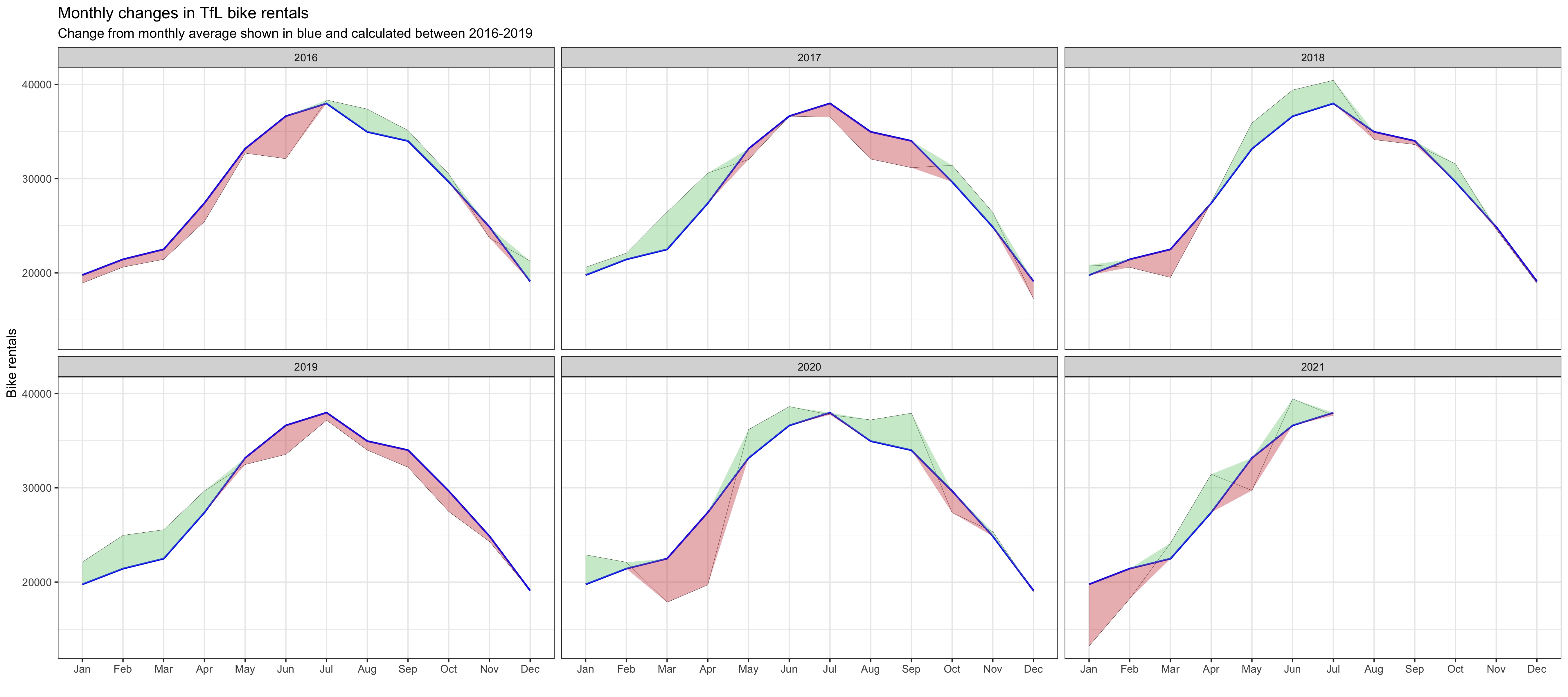
Plot 1
Data Cleaning
# Clean the data
bike_exp <- bike %>%
  filter(year > 2015) %>% #Filter all the data that after 2015
  group_by(month) %>%
  summarise(expected_rentals=mean(bikes_hired)) # Calculate the expected rentals
# Replicate the first graph of actual and expected rentals for each month across years
plot <- bike %>%
  filter(year > 2015) %>%
  group_by(year, month) %>%
  summarise(actual_rentals=mean(bikes_hired)) %>% # Calculate the actual mean rentals for each month
  inner_join(bike_exp, by='month') %>% # Combine the data with original dataset
  mutate(
    up=if_else(actual_rentals > expected_rentals, actual_rentals - expected_rentals, 0),
    down=if_else(actual_rentals < expected_rentals, expected_rentals - actual_rentals, 0)) %>% # Create the up and down variable for plotting the shaded area using geom_ribbon
  ggplot(aes(x=month)) +
  geom_line(aes(y=actual_rentals, group=1), size=0.1, colour='black') +
  geom_line(aes(y=expected_rentals, group=1), size=0.7, colour='blue') + # Create lines for actual and expected rentals data for each month across years
  geom_ribbon(aes(ymin=expected_rentals, ymax=expected_rentals+up, group=1), fill='#7DCD85', alpha=0.4) +
  geom_ribbon(aes(ymin=expected_rentals, ymax=expected_rentals-down, group=1), fill='#CB454A', alpha=0.4) + # Create shaded areas and fill with different colors for up and down side
  facet_wrap(~year) + # Facet the graphs by year
  theme_bw() + # Theme
  labs(title="Monthly changes in TfL bike rentals", subtitle="Change from monthly average shown in blue and calculated between 2016-2019", x="", y="Bike rentals") +
  NULL
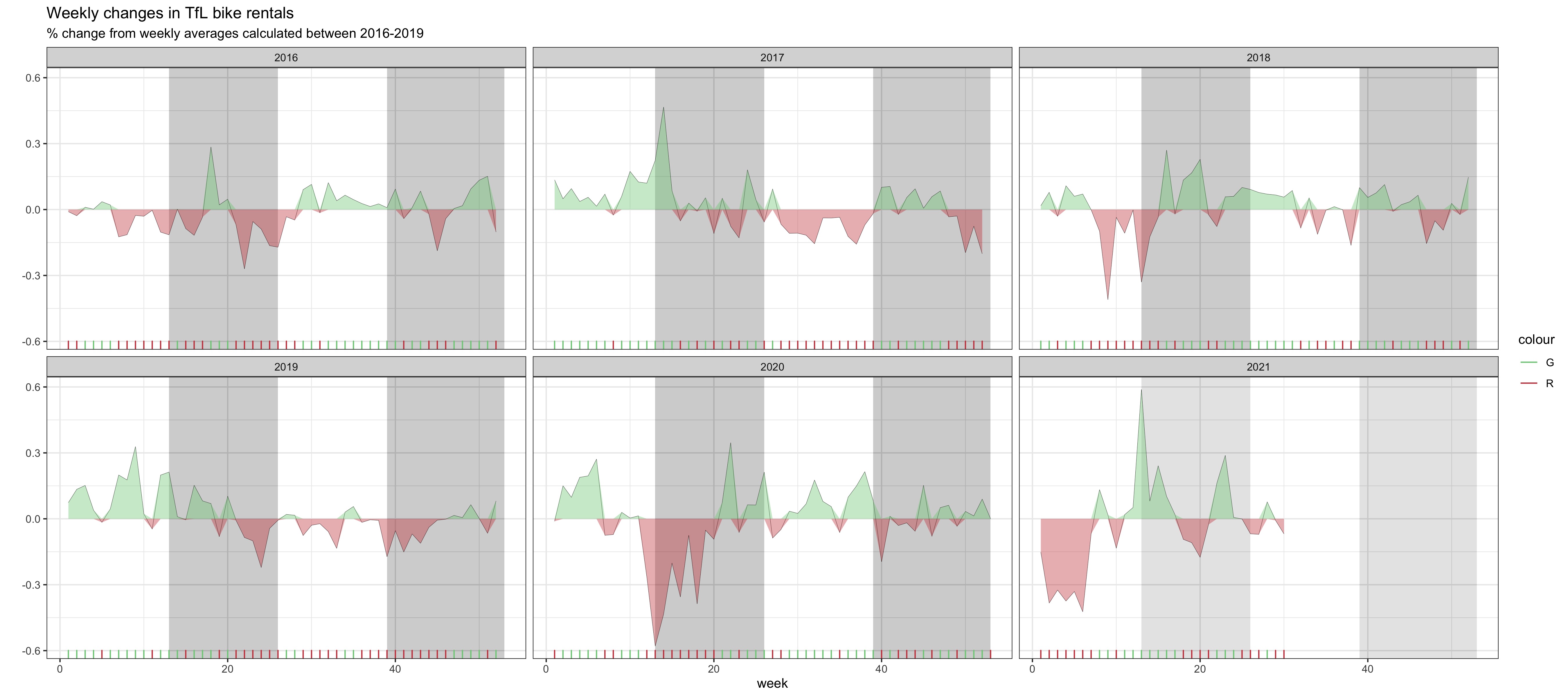
Plot 2
Data Cleaning
# Clean the data
bike_exp_week <- bike %>%
  filter(year > 2015) %>%
  mutate(week=if_else(month == 'Jan' & week == 53, 1, week)) %>% # Create week variable for the dataset
  group_by(week) %>%
  summarise(expected_rentals=mean(bikes_hired))
# Make the graph
plot <- bike %>%
  filter(year > 2015) %>%
  mutate(week=if_else(month == 'Jan' & week == 53, 1, week)) %>%
  group_by(year, week) %>%
  summarise(actual_rentals=mean(bikes_hired)) %>%
  inner_join(bike_exp_week, by='week') %>%
  mutate(
    actual_rentals=(actual_rentals-expected_rentals)/expected_rentals, #Calculate the excess rentals
    up=if_else(actual_rentals > 0, actual_rentals, 0),
    down=if_else(actual_rentals < 0, actual_rentals, 0), # Create the up and down variable for plotting the shaded area using geom_ribbon
    colour=if_else(up > 0, 'G', 'R')) %>% # Define the colors for up and down side
  ggplot(aes(x=week)) +
  geom_rect(aes(xmin=13, xmax=26, ymin=-Inf, ymax=Inf), alpha=0.005) +
  geom_rect(aes(xmin=39, xmax=53, ymin=-Inf, ymax=Inf), alpha=0.005) + # Add shaded grey areas for the according week ranges
  geom_line(aes(y=actual_rentals, group=1), size=0.1, colour='black') +
  geom_ribbon(aes(ymin=0, ymax=up, group=1), fill='#7DCD85', alpha=0.4) +
  geom_ribbon(aes(ymin=down, ymax=0, group=1), fill='#CB454A', alpha=0.4) + # Create shaded areas and fill with different colors for up and down
  geom_rug(aes(color=colour), sides='b') + # Plot rugs using geom_rug
  scale_colour_manual(breaks=c('G', 'R'), values=c('#7DCD85', '#CB454A')) +
  facet_wrap(~year) + # Facet by year
  theme_bw() + # Theme
  labs(title="Weekly changes in TfL bike rentals", subtitle="% change from weekly averages calculated between 2016-2019", x="week", y="") +
  NULL