
Student Hub Proposal
I was given the task to update the content and functionality of the online student portal for the New York Film Academy. I recognized inefficiencies in UX/UI design and began to gather and analyze data to make informed decisions about the students' needs for the website. The following is my methodology: Gathered and analyzed user statistics such as total page views and unique visitor traffic Analyzed other universities' student portals as case studies Sent out a 16 question survey and analyzed responses from 157 students across all 3 campuses Conducted 2 student focus groups and 1 staff focus group Prepared a 16-page website rebranding proposal in Adobe InDesign that included all of my research, a proposed site map, mockups, and an implementation plan I presented the proposal to the President of NYFA and a committee made up of Deans from all three campus locations for approval into the next phase of implementation.
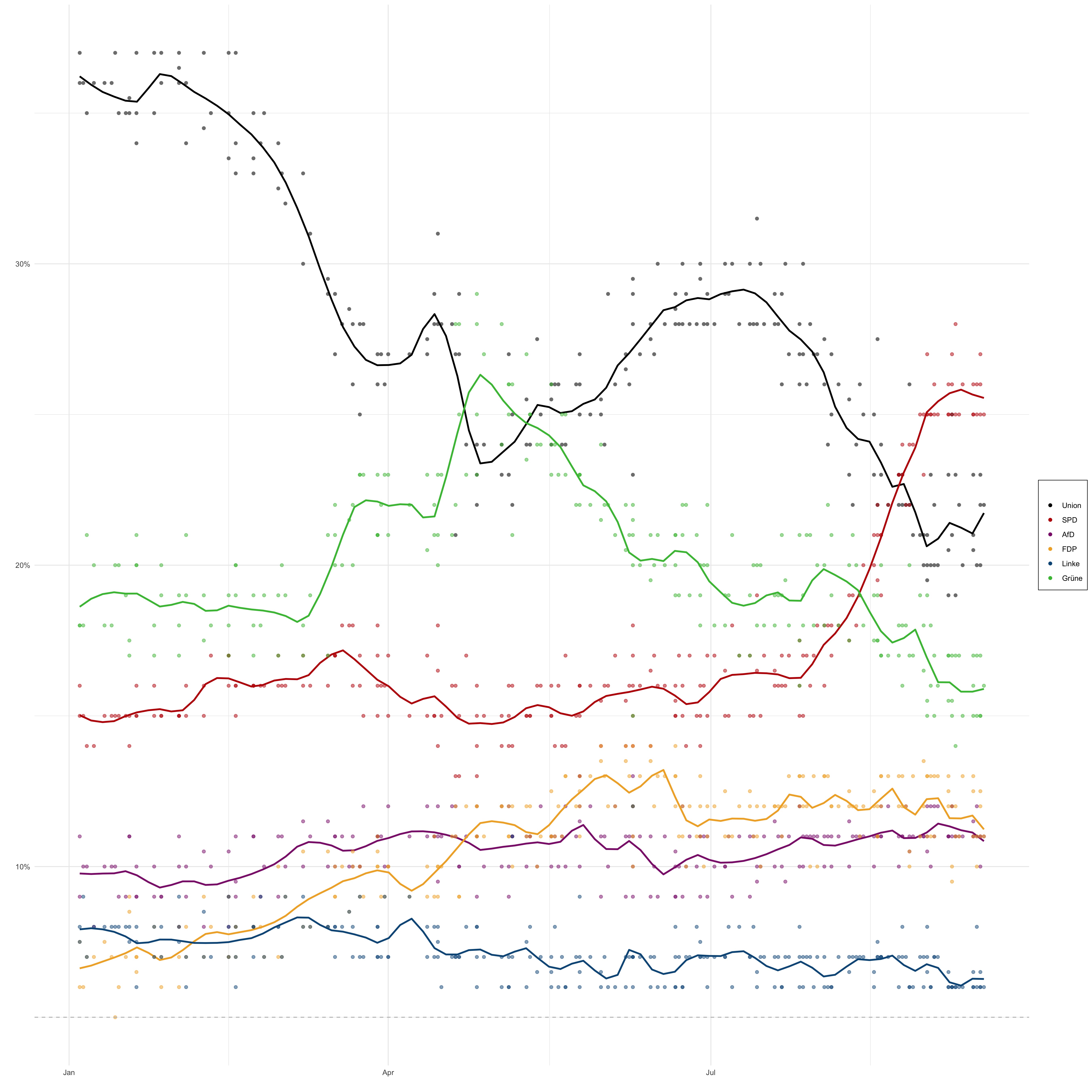
German Election Polls
#Select only necessary columns of the dataset german_election_polls_cleaned <- german_election_polls %>% select(end_date, union, spd, af_d, fdp, linke, grune) #Assigning colors to each political party, extracted from original plot using adobe color col_union <- 'black' col_spd <- '#BF0404' col_af_d <- '#8C1F7A' col_fdp <- '#F2AE2E' col_linke <- '#0A5789' col_grune <- '#45BF41' #Plotting the election outcomes german_elections_plot <- german_election_polls_cleaned %>% ggplot + geom_point(aes(x=end_date, y=union, colour='black')) + #Union Party points assigned the color black geom_smooth(aes(x=end_date, y=union), colour='black', span=0.
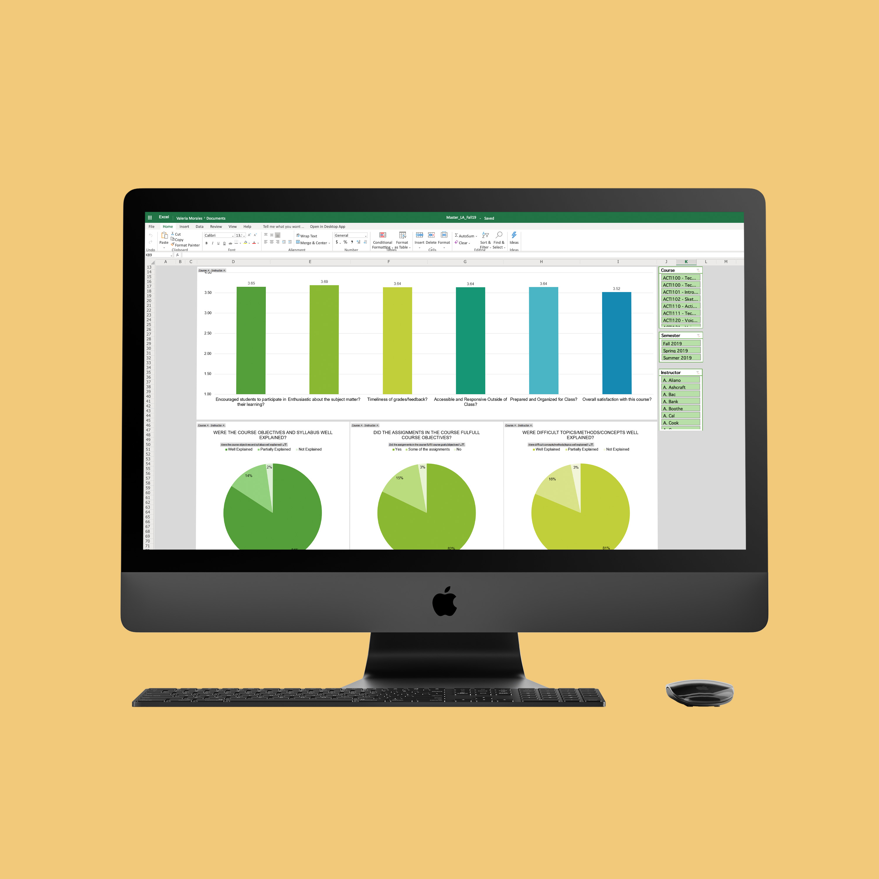
Course Evaluation Dashboards
I was given the task to update course evaluations from paper-based to web-based in order to increase efficiency and improve department management. I utilized Excel Pivot Tables to create the first data dashboards at NYFA. The dashboards are user friendly and interactive as they can be filtered by semester, course, and professor. I presented the dashboards to the Department Chairs at the Los Angeles campus and taught them how to the dashboards can be used to develop insight about their department.
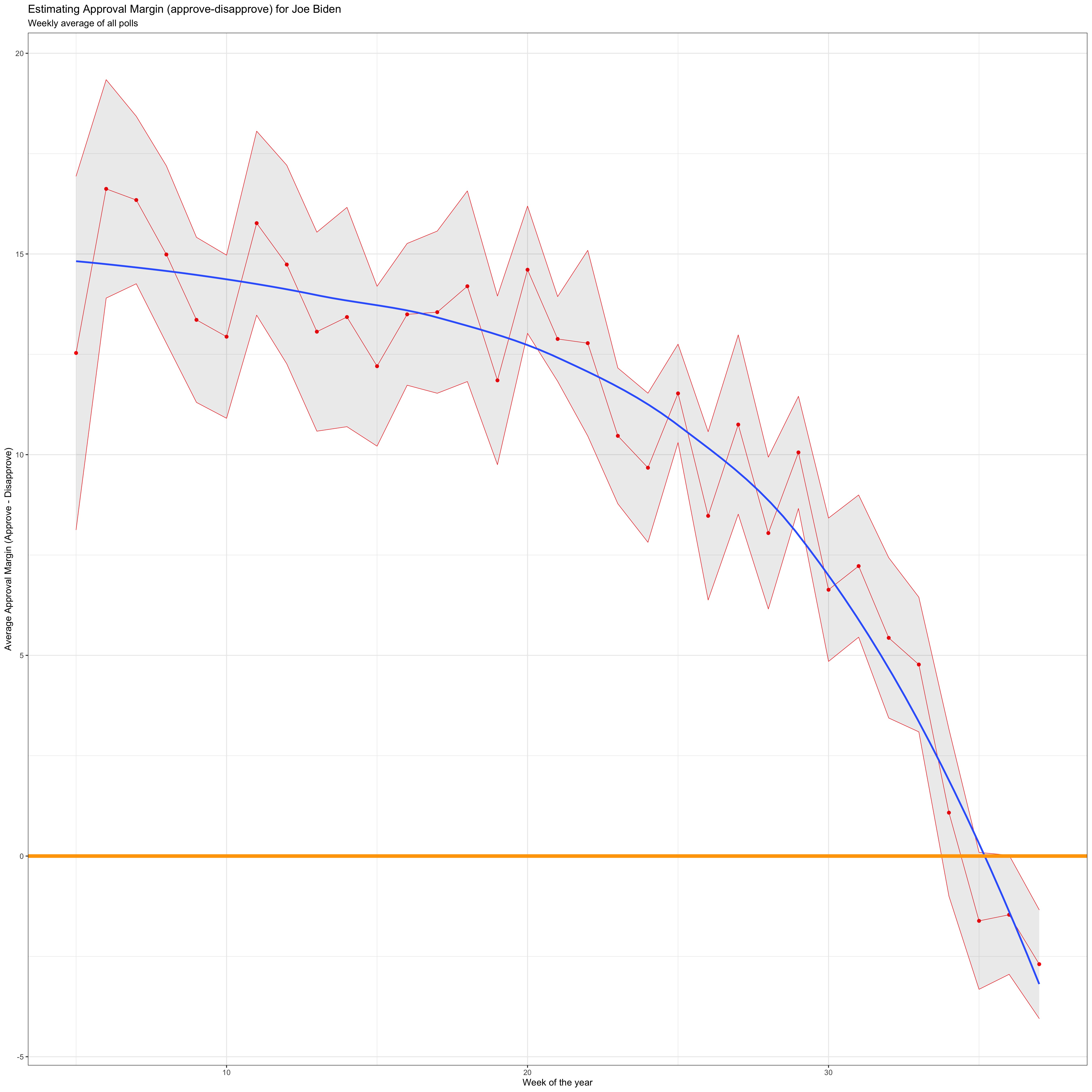
Biden's Approval Margin
plot <- approval_polllist %>% mutate(week=week(enddate)) %>% #Creating a new column called week by extracting the week from the enddate variable group_by(week) %>% mutate( net_approval_rate=approve-disapprove #Creating a new column called net_approval_rate by subtracting disapprove from approve ) %>% summarise( mean=mean(net_approval_rate), #Mean net approval by week sd=sd(net_approval_rate), #Standard deviation of net approval by week count=n(), #Count by week se=sd/sqrt(count), #Standard error of the week t_critical=qt(0.975, count-1), #T-critical value lower=mean-t_critical*se, #Lower end of the CI upper=mean+t_critical*se #Upper end of the CI ) %>% #Scatterplot of the calculated net approval rate means by week ggplot(aes(x=week, y=mean)) + geom_point(colour='red') + #Scatterplot using red points geom_line(colour='red', size=0.
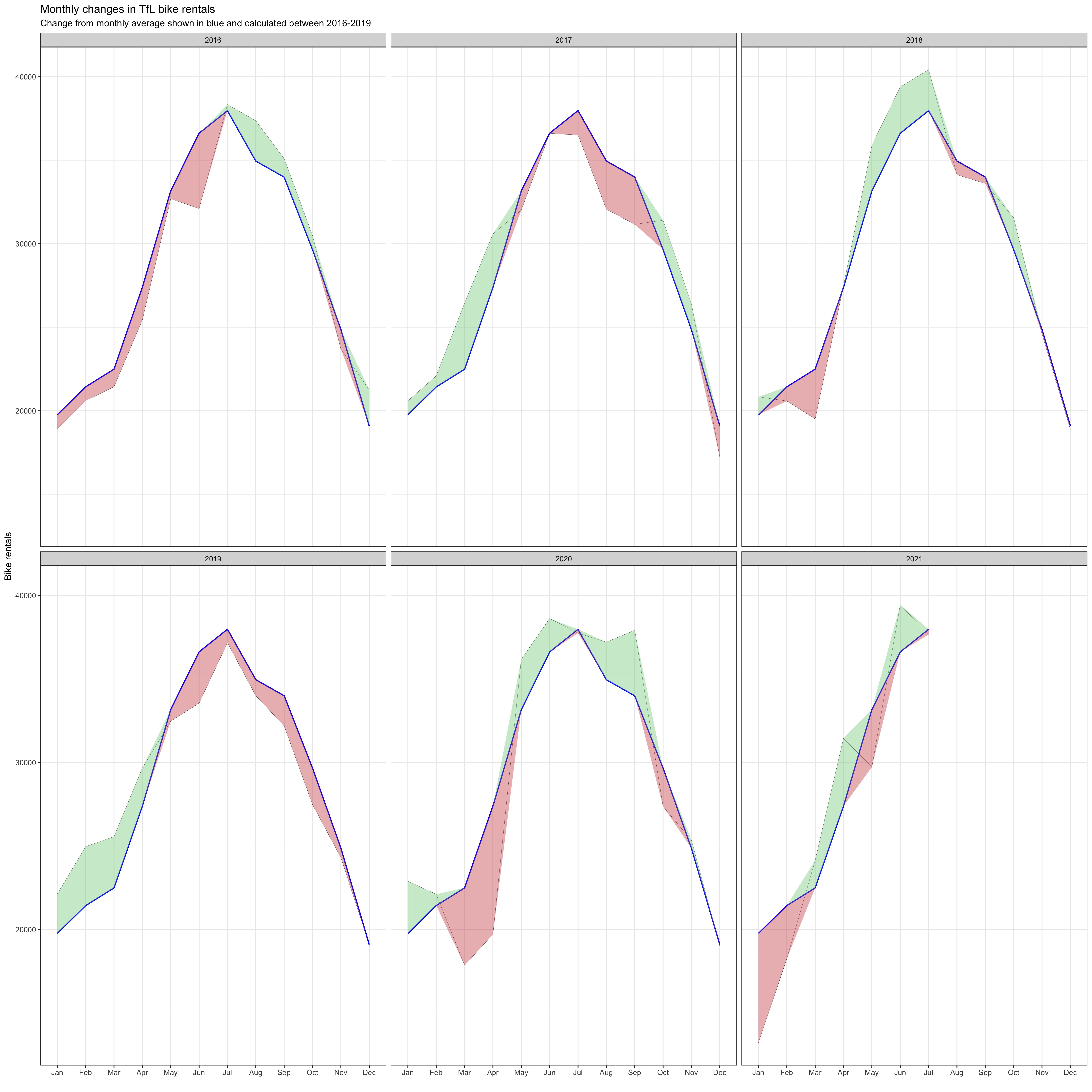
Santander Bike Rentals
Plot 1 Data Cleaning # Clean the data bike_exp <- bike %>% filter(year > 2015) %>% #Filter all the data that after 2015 group_by(month) %>% summarise(expected_rentals=mean(bikes_hired)) # Calculate the expected rentals # Replicate the first graph of actual and expected rentals for each month across years plot <- bike %>% filter(year > 2015) %>% group_by(year, month) %>% summarise(actual_rentals=mean(bikes_hired)) %>% # Calculate the actual mean rentals for each month inner_join(bike_exp, by='month') %>% # Combine the data with original dataset mutate( up=if_else(actual_rentals > expected_rentals, actual_rentals - expected_rentals, 0), down=if_else(actual_rentals < expected_rentals, expected_rentals - actual_rentals, 0)) %>% # Create the up and down variable for plotting the shaded area using geom_ribbon ggplot(aes(x=month)) + geom_line(aes(y=actual_rentals, group=1), size=0.
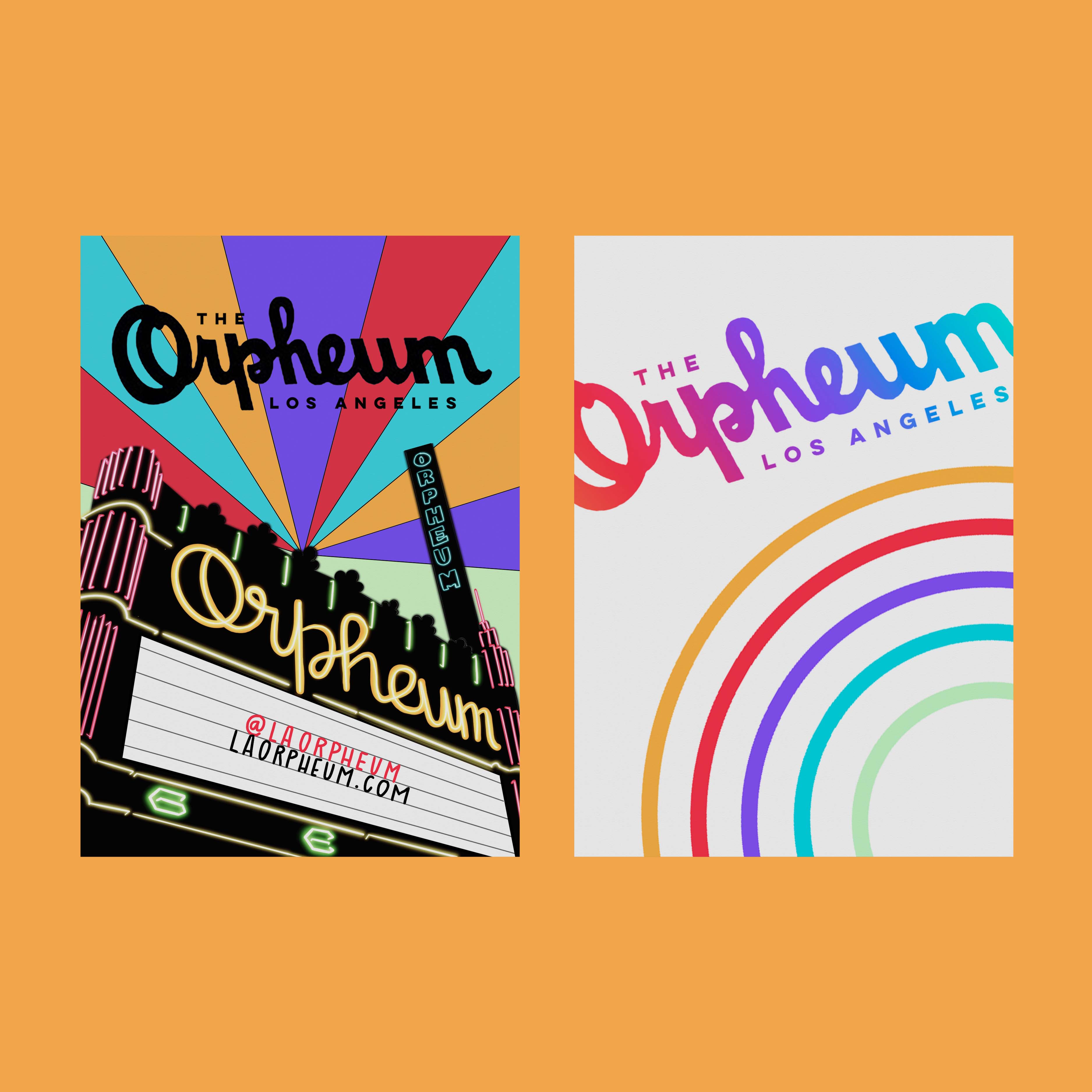
Orpheum Theatre Rebrand
In winter 2020, I took my final Digital Humanities course, DH 199, a research based course under the umbrella topic of “Downtown Los Angeles Broadway Theaters.” After delving into the rich history of these grandiose theaters, I decided to focus our final project on rebranding an entire theatre, the Orpheum, in the hopes of bringing life back to the theatre district in downtown LA. We presented our final project to a few board members of the Historic Theatre Foundation.
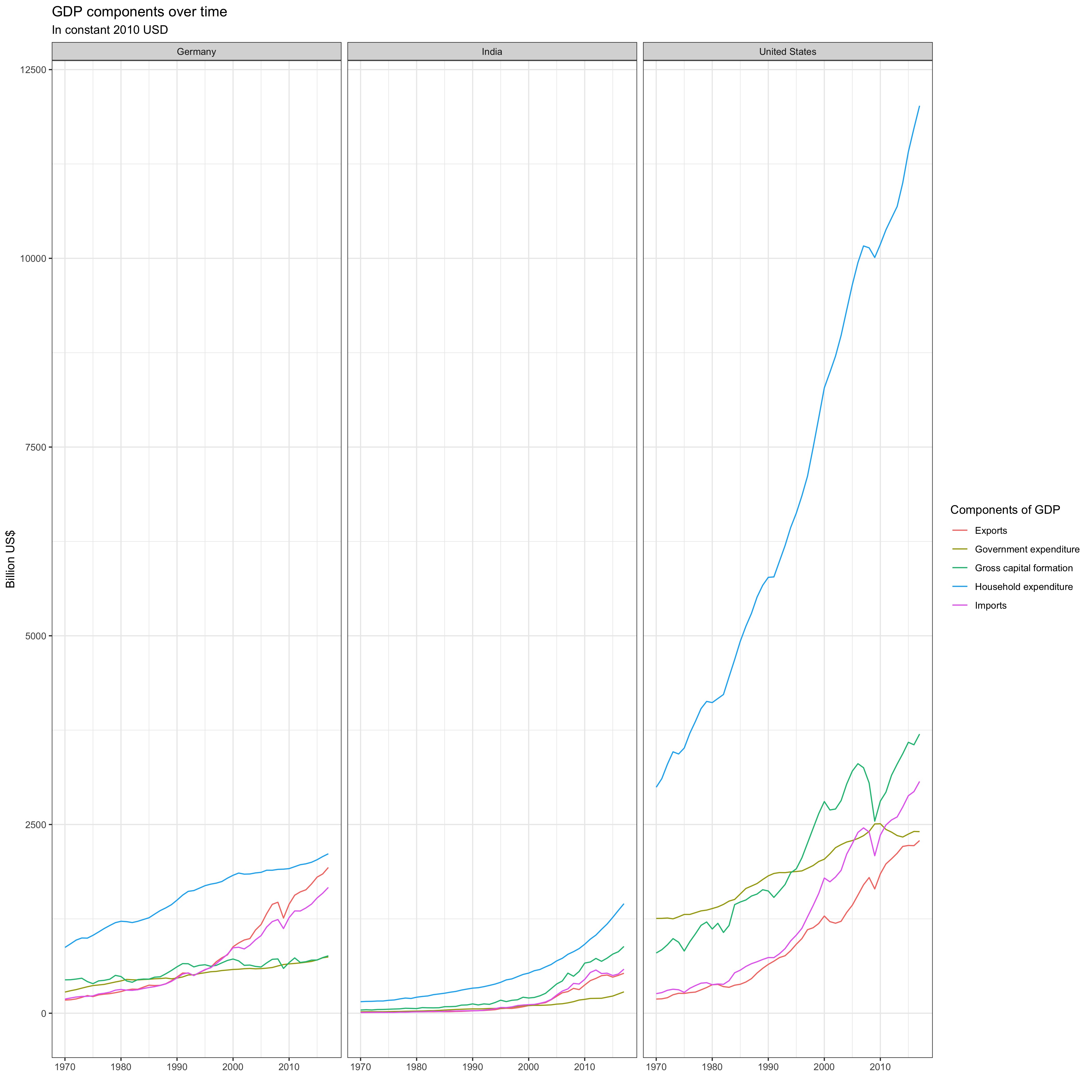
GDP Components
Data Cleaning #Creating a new data set after converting to the long format, transforming the figure to billions, and simplifying the indicator names tidy_GDP_data <- UN_GDP_data %>% pivot_longer(cols = 4:51, names_to = 'Year', values_to = 'Value') %>% mutate( Value = Value/1e9, IndicatorName = case_when( IndicatorName == "Household consumption expenditure (including Non-profit institutions serving households)" ~ "Household expenditure", IndicatorName == "General government final consumption expenditure" ~ "Government expenditure", IndicatorName == "Gross fixed capital formation (including Acquisitions less disposals of valuables" ~"Gross fixed capital formation", IndicatorName == "Exports of goods and services" ~ "Exports", IndicatorName == "Imports of goods and services" ~ "Imports", IndicatorName == "Gross Domestic Product (GDP)" ~ "GDP", IndicatorName == "Agriculture, hunting, forestry, fishing (ISIC A-B)" ~ "AHFF", IndicatorName == "Mining, Manufacturing, Utilities (ISIC C-E)" ~ "MMU", IndicatorName == "Manufacturing (ISIC D)" ~ "Manu", IndicatorName == "Construction (ISIC F)" ~ "Cons", IndicatorName == "Wholesale, retail trade, restaurants and hotels (ISIC G-H)" ~ "WRRH", IndicatorName == "Transport, storage and communication (ISIC I)" ~ "TSC", IndicatorName == "Other Activities (ISIC J-P)" ~ "Others", IndicatorName == "Total Value Added" ~ "Total", TRUE ~ as.
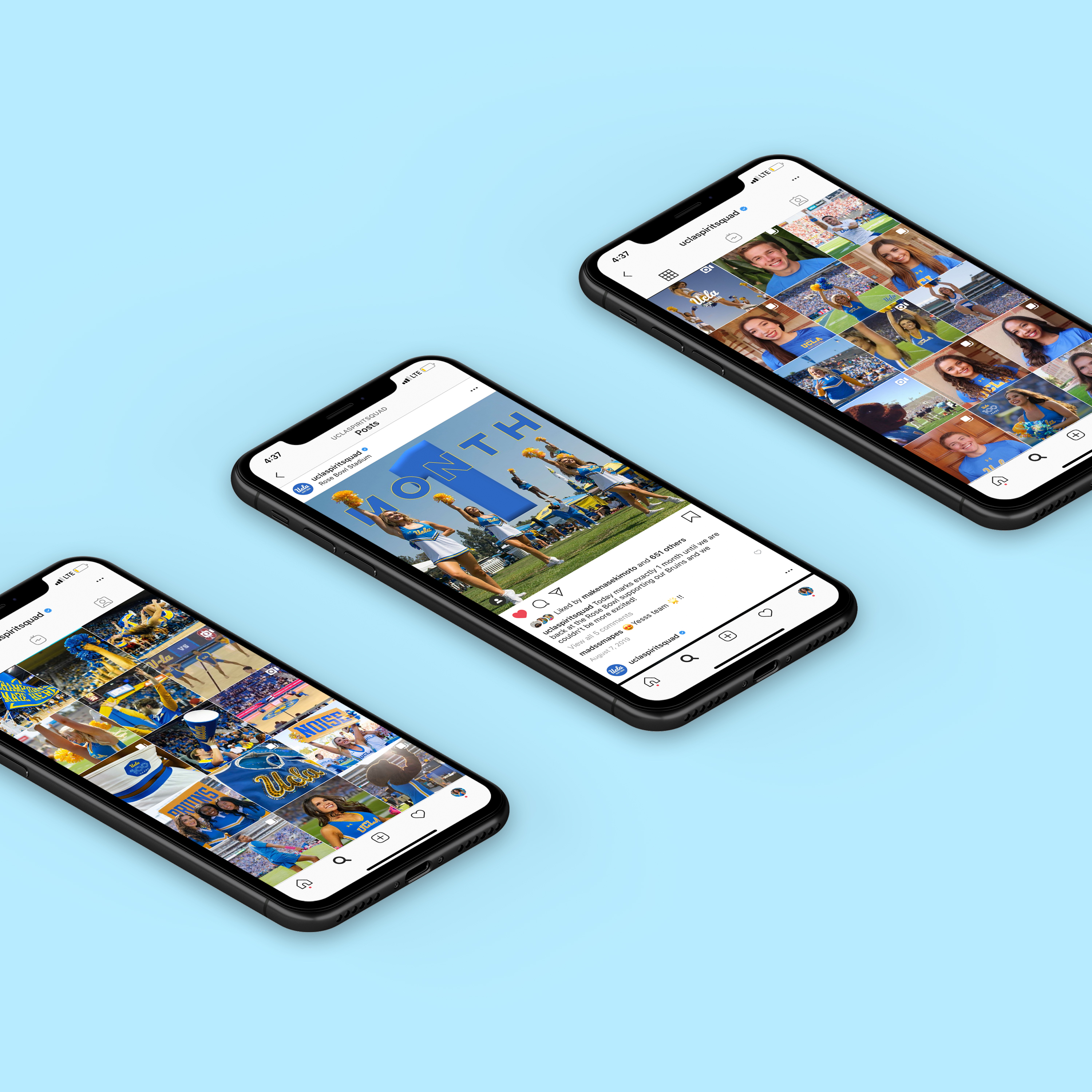
Spirit Squad Media Branding
In May 2018 I became a member of and Media Coordinator for the UCLA Spirit Squad. I led the rebranding of the Spirit Squad social media to follow our word of the year: warrior. The Instagram thus had a darker, fiercer feel with black as its primary color. I created templates in Adobe Photoshop for birthday, gameday, and miscellaneous marketing posts to follow the branding. In May 2019 I was promoted to Media Marketing Director for the UCLA Spirit Squad.

Bruin Spirit Marketing
As a Digital Marketing Director for the Bruin Spirit Executive Committee in the Student Alumni Association, I assisted with marketing efforts for 2 of the largest spirit events at UCLA: the Beat ‘SC Bonfire and I Heart UCLA Week. For the Beat ‘SC Bonfire, I drafted the “Beat ‘SC History” video that was viewed live by an audience of about 2000 and has been viewed over 3000 times on Facebook. For I Heart UCLA Week, I designed the Snapchat filter that was available to an audience of 45000+ for 1 week.
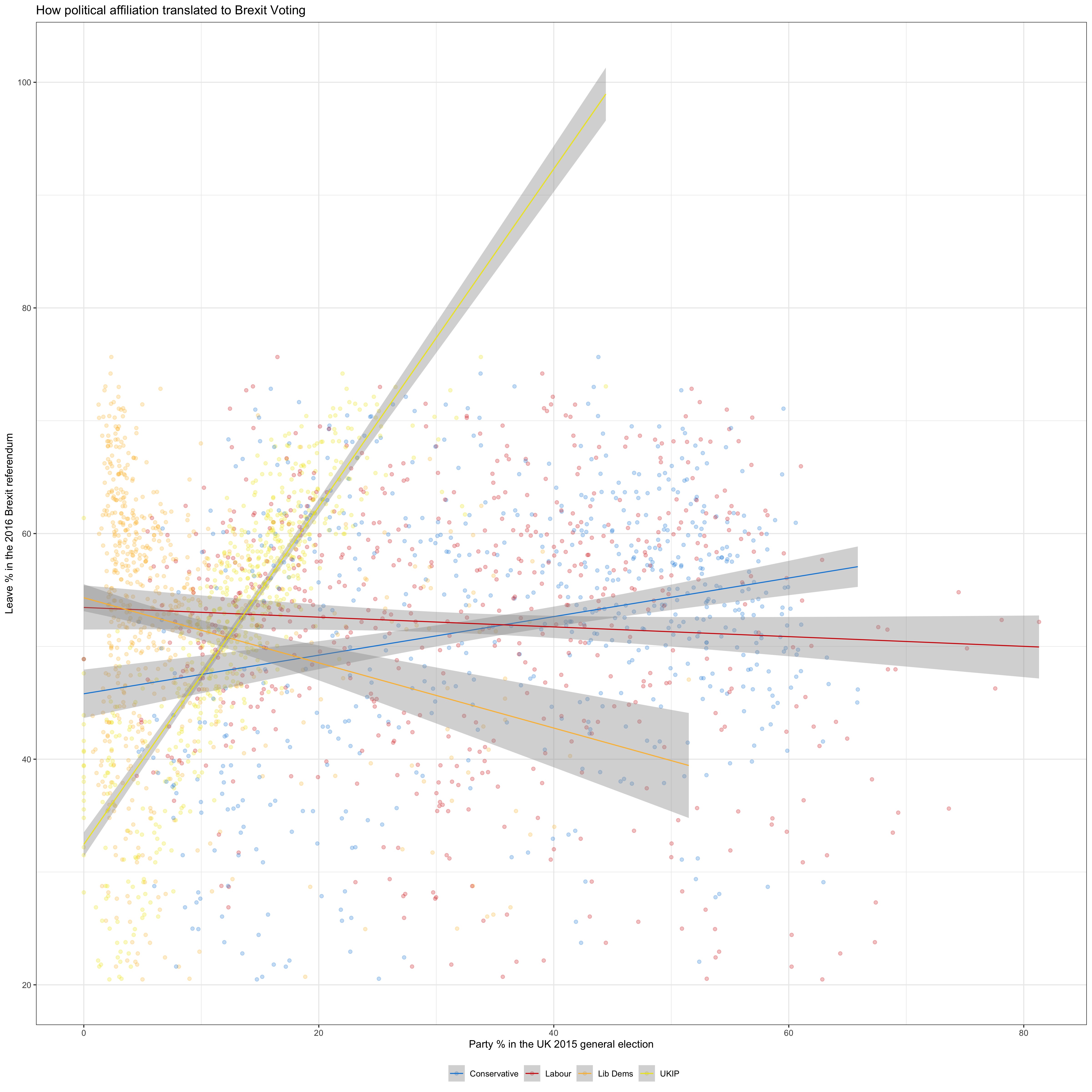
Brexit Votes
brexit <- read_csv(here::here('data', 'brexit_results.csv')) glimpse(brexit) #exporing the brexit data frame #converting the table to a longer format so as to male a scatter plot with a trend line for each of the patrties plot <- brexit %>% pivot_longer(cols=2:5, names_to='party_name', values_to='party_pct') %>% ggplot(aes(x=party_pct, y=leave_share, colour=party_name)) + theme_bw() + geom_point(alpha=0.25) + geom_smooth(method='lm', size=0.5) + #adding a different colour to the trend lines and points of each party scale_colour_manual( labels = c('Conservative', 'Labour', 'Lib Dems', 'UKIP'), values=c('#0087dc', '#d50000', '#fdbb30', '#efe600')) + #Position he legend at the bottom theme(legend.

UCLA Library Pamphlets
In December 2017, I was approached by a co-worker at Powell Library to help design a series of pamphlets for the UCLA Libraries. The purpose of the pamphlets is for students to have a guide of the study spots available at each library, alongside features of said study spot. For 3 months, I worked alongside co-worker to create a personalized “Where to Study” pamphlet for 7 UCLA Libraries. We took inventory of the study spaces in each library, and utilized Canva to create the pamphlets while maintaining the colors and branding of the UCLA Library system.
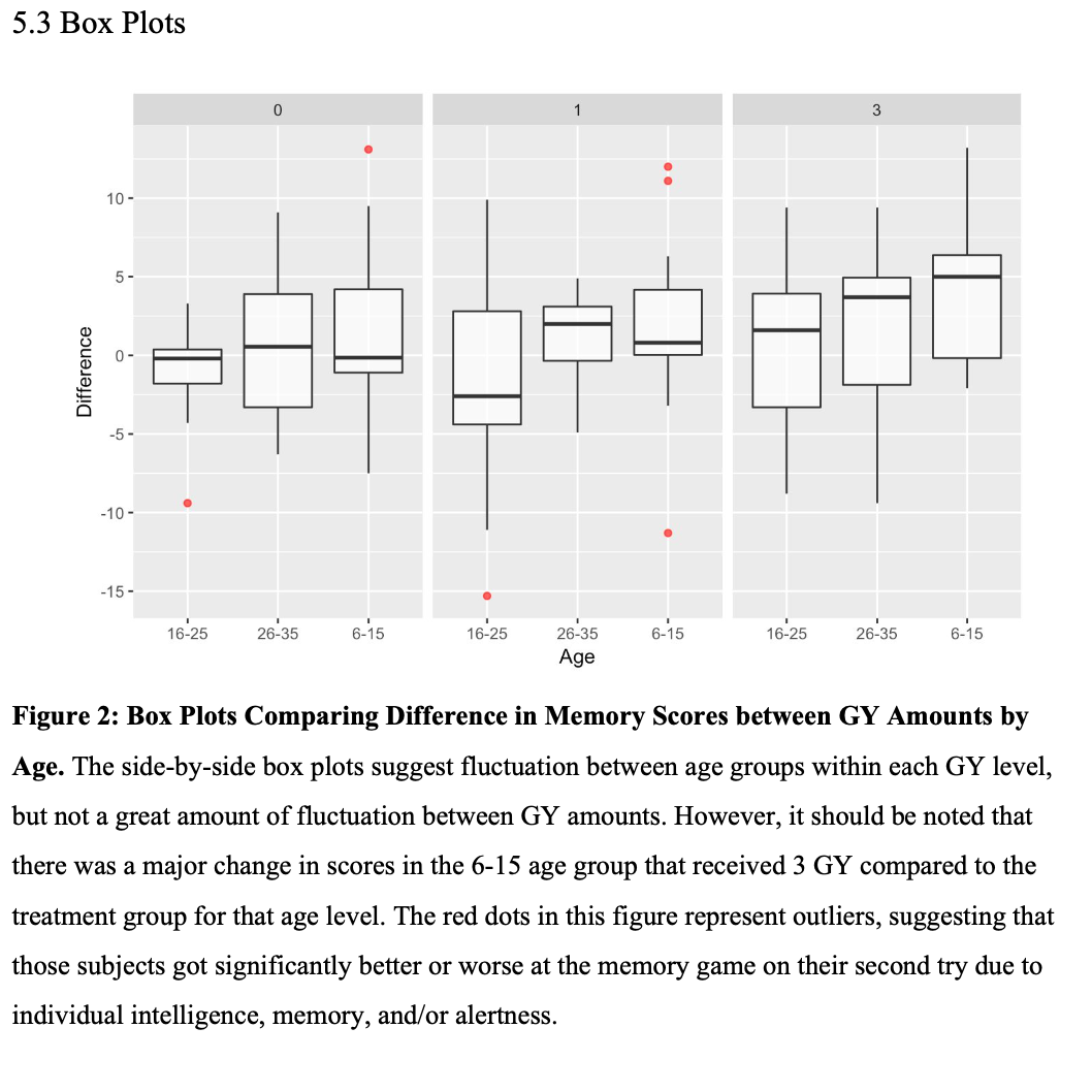
Radiation Statistics Experiment
For the final project of Statistics 101B: Design of Experiment, I was asked to collaborate with a group to create and execute a statistical experiment on mock subjects. After extensive research, my group and I decided to analyze whether radiation has an effect on cognitive memory. The subjects we used were “Islanders,” a virtual population that supports learning and teaching in experimental design. Although they were not real people, any experiments done on the subject were in real time so timing had to be considered.